FitMyLens: making a 2,000-page lens reference buyable on a phone
FitMyLens answers one question: which lenses fit my camera. I own it, I designed it, and I run it with an agent system I built. I set the design rules and the measurement bar. The agents ship inside them, and every change below went out with a before and after capture at 375 px.
It is a small site, and I will say how small further down. I chose it for this page because every decision on it is mine to show, including the ones I got wrong.
- 2,188pages in the sitemap, counted 21 Sep 2026
- 82camera hub pages, each with one recommended lens
- 562buy links on a single mount page
- 375 pxthe width every change is judged at
The problem
The pages were built as reference tables first. On a desktop that works. On a phone, the Sony E mount page was 32,745 px tall, and the part most people came for, lenses grouped by what you shoot, sat under 194 table rows. A visitor could read the right answer at the top of a camera page and then tap a button that did not lead to a product they could buy.
So the brief I gave myself was narrow. At 375 px, the answer and a working buy path should be reachable without a long scroll. And no fix is allowed to make a factual claim on the page untrue.
1. The table that pushed everything else off the phone
The mount pages list every lens that fits, 194 of them for Sony E. I folded each table to its first 20 rows with a "Show all 194 lenses" control. Sorting still runs on all 194 rows while folded, so sorting by aperture shows the 20 brightest, not the first 20 alphabetically.
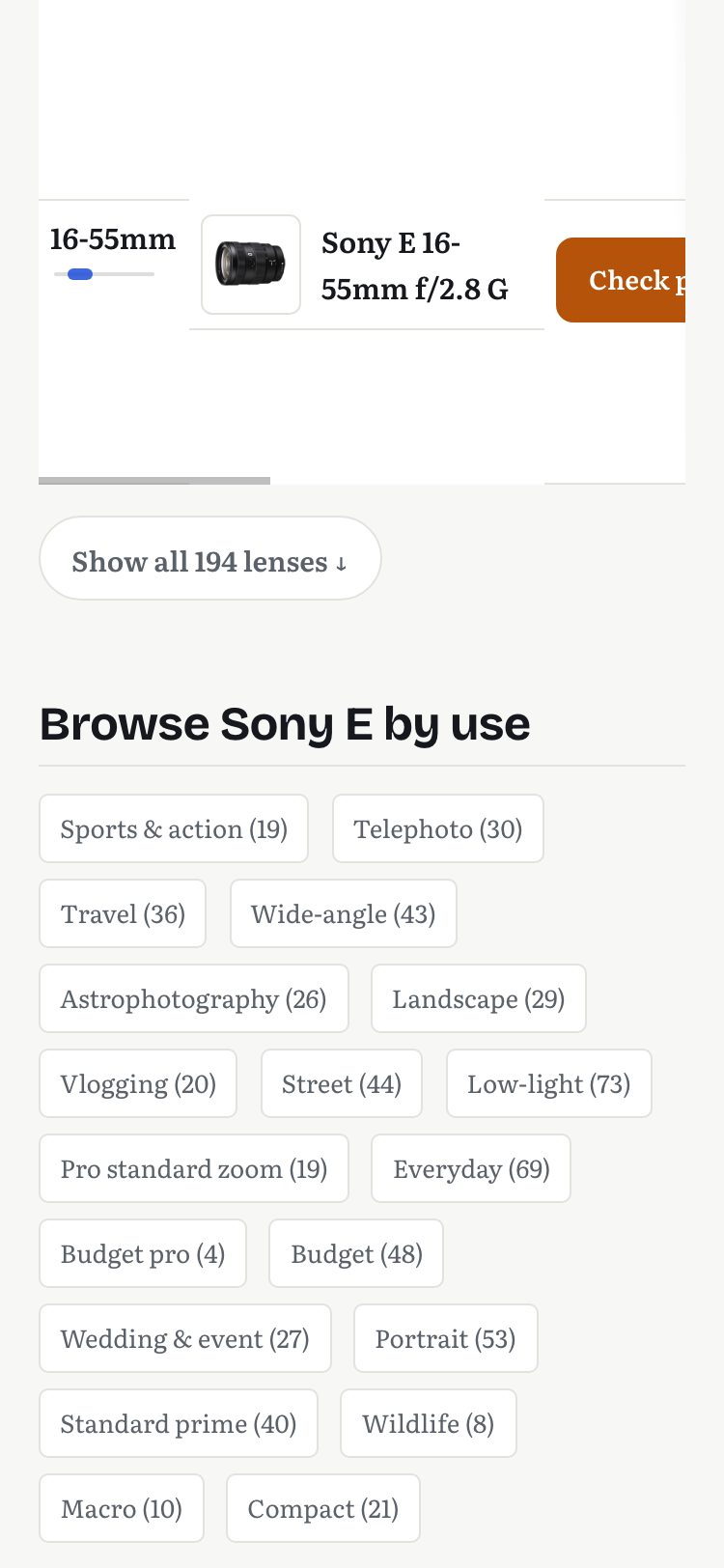
| Sony E mount page, 375 px | Before | After |
|---|---|---|
| Page height | 32,745 px | 6,543 px |
| "Browse by use" starts at | 30,713 px | 4,511 px |
| Buy links on the page | 562 | 562 |
| Rows in the HTML / rows shown | 194 / 194 | 194 / 20 |
| Horizontal overflow | none | none |
Measured with Chrome DevTools device emulation at 375 × 812, on the live page before and after the deploy, 21 Sep 2026.
Two things I would rather say myself. The HTML got 1.1 KB larger, because every row is still served and only the rendered height changed. Hiding rows from search engines would have cost more than it saved. And the fold cuts both ways.
The use links are 26,000 px closer. But 174 of the lens rows, each with a buy link, now sit behind one tap. I do not know yet which effect is bigger. I will read it when there are a few weeks of data on each side.
2. A button that promised a lens and delivered a search
Every camera page opens with one recommendation and a buy button. On 12 of the 82 pages, the recommended lens was the brightest that fits but was not sold as a product on Amazon US. The button quietly opened a search results page. The visitor did what the page asked and landed somewhere that did not match it.
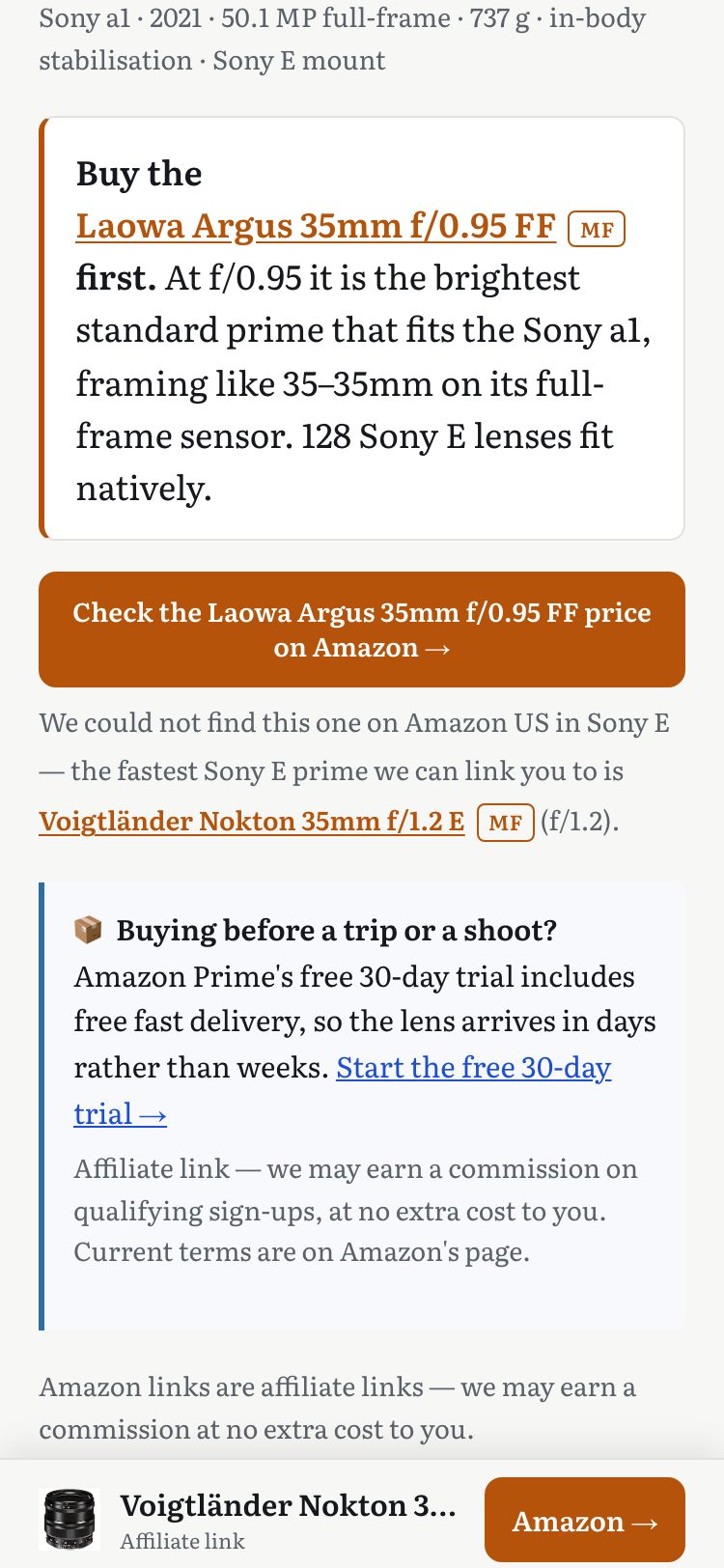
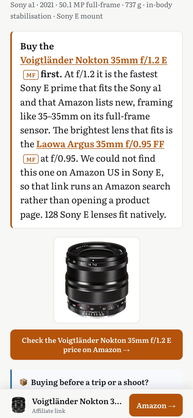
| 82 camera hub pages | Before | After |
|---|---|---|
| Main button opens a search, not a product | 12 of 82 | 0 of 82 |
| Button and sticky bar name the same lens | not checked | 82 of 82 |
Counted from the built pages at deploy time, 21 Sep 2026. Both captures taken with the answer paragraph at the same scroll position.
The quick fix was tempting. Relabel the buyable lens as "the brightest" and the button would be consistent. It would also be false, and the site's own history shows that exact change shipping once and being reverted for that reason. So the button now buys what can be bought, and the brightest lens keeps its claim one sentence later, with the reason it is not the button.
3. A buy path that stays on screen
A camera page runs to about 46,000 px on a phone. After the first screen, the only way to buy was to scroll back up. I added a 57 px bar fixed to the bottom with the recommended lens and one button.
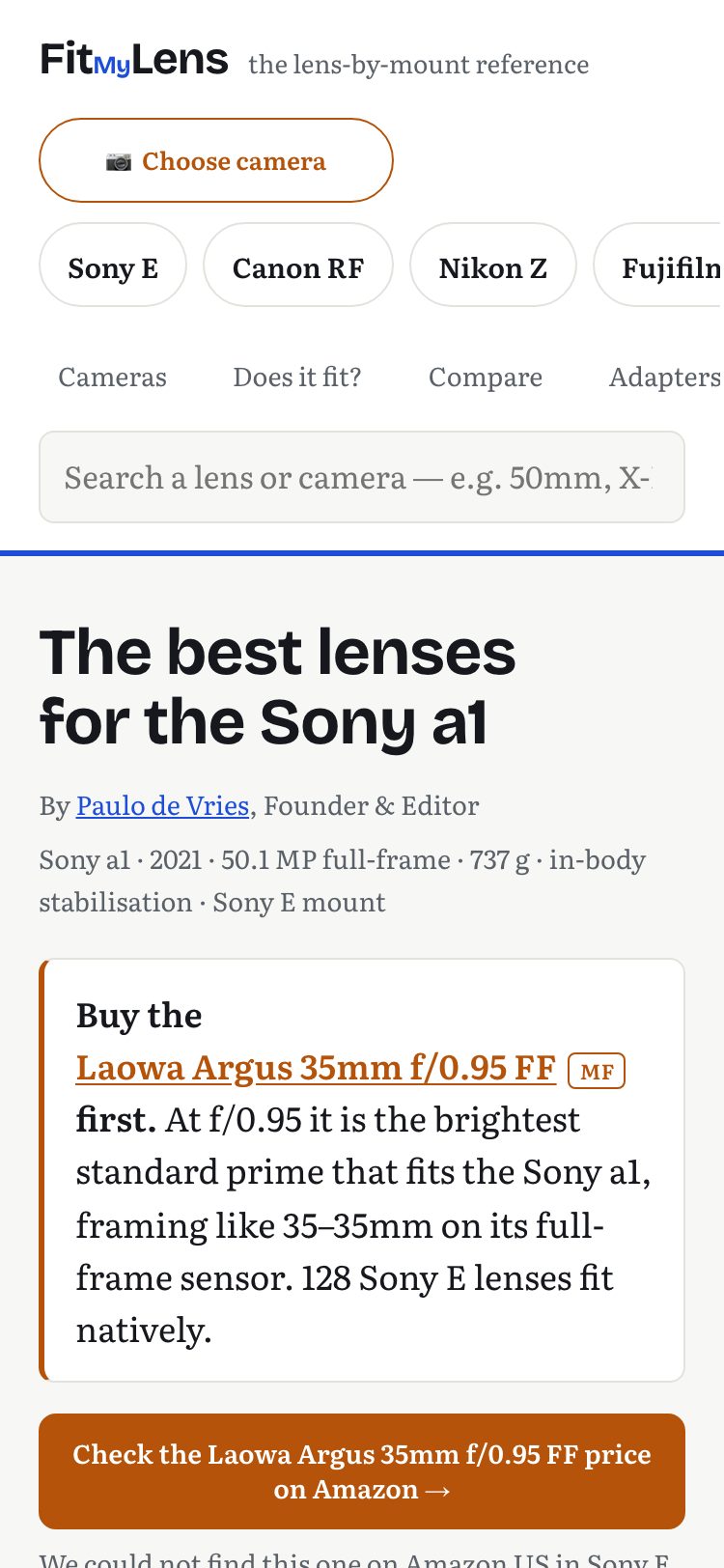
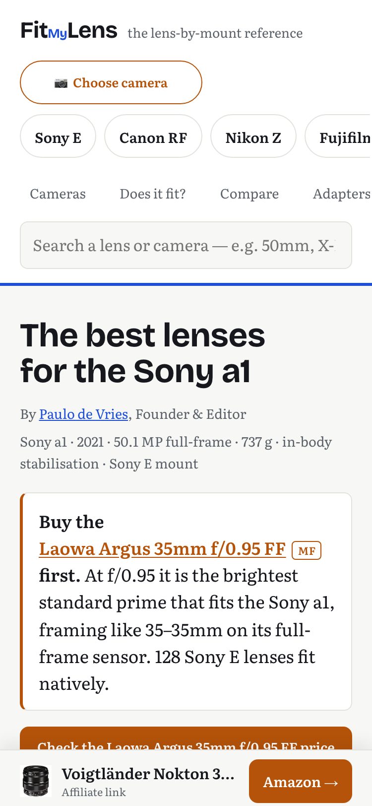
| 82 camera hub pages | Before | After |
|---|---|---|
| Fixed buy bars per page | 0 | 1 |
| Bar height | n/a | 57 px |
| Added page height | n/a | +64 px |
Measured the same way, 21 Sep 2026. The 64 px is the padding reserved under the content, so the bar never covers the last line.
What I backed out
On 11 September a change was ready that relabelled the buy button from "Amazon" to "Check price". I still think it is the better label. The site never shows a price, so the click really is a price check. I reverted it before it shipped, because an experiment was already running on that exact pair of buttons, with readings due on 22 September and 8 October. Changing the label in the middle would have contaminated the comparison, and an earlier fix had already done that to one slice of it. The label went back to what the experiment was measuring. The reason is written down next to the revert.
Where my data stops
All three changes above shipped on 21 September 2026. There is no after-period yet, so I am not going to claim a lift.
I can say what the baseline is and why I trust it. About 96 percent of the site's sessions arrive as direct traffic with one page view each, which is what crawlers look like. They produced 4 of the last 130 buy clicks. Organic search is the human channel: 206 sessions and 121 buy clicks in the 30 days to 21 September, from consented visitors only. That is about seven human sessions a day. A readable before and after needs several weeks on each side, and I would rather wait for it than report a rate I cannot defend.
I also cannot show revenue per page. Amazon stopped reporting earnings for small sites individually on 14 September. So the outcome numbers on this page are interface numbers I measured myself. When the human data is in, this page gets a second part.
How I work
I judge at 375 px first, and I capture before I change anything. Before I ship, I write down the number that would prove me wrong. When a fix would make a sentence on the page untrue, the sentence wins.
The site is at fitmylens.com. Open it on your phone.